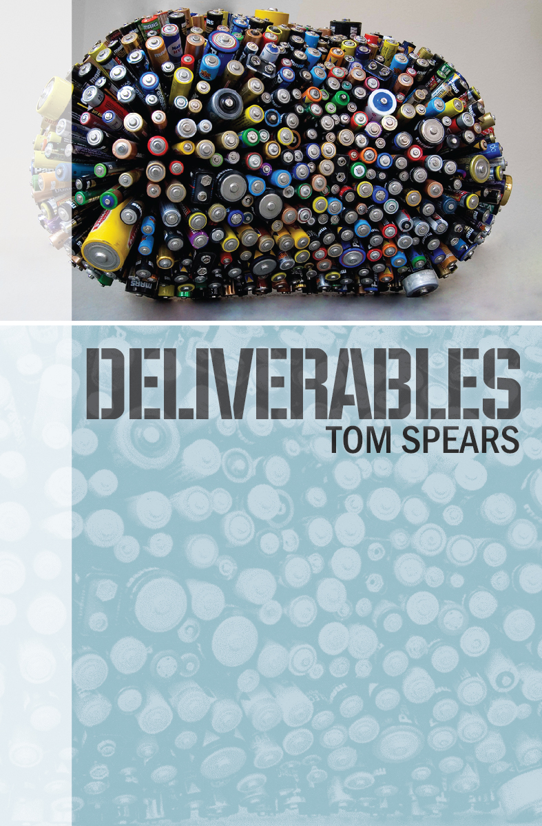
I happened upon an article published on CreateSpace (in their current newsletter, actually), which described the six rules for designing a book cover. I was intrigued, and after reading the article, decided to measure my cover design for the proof copy of LEVERAGE. Let's see how I did...
- Make the subject matter clear -- let's see, LEVERAGE is a corporate thriller, and I used a stock picture of a running track for the photo. And I used the wrong fonts as well. FAIL.
- Communicate one big idea -- Yes, I think I did that, though that idea might be "here is a book about track". PASS.
- Emphasize who the book is targeted toward -- I think the back-cover description, and the subtitle of "A Corporate Thriller" help here. PASS - barely.
- Entice the browser to click/look -- I wouldn't pick it up if I found it on the shelf myself. tragic FAIL.
- Convince the potential reader the book will enhance their life -- only by entertaining them, and I don't think I do that well with the cover design/photo. FAIL.
- Sell the book -- Okay, this one is a throw away. If you did the other things, then this would work. If not, then the cover won't help sell the novel. NO GRADE.
In summary, I failed 3 out of 5, and one of the passes was borderline.
Sounds like I need a new cover design, and another proof copy!


